Sunday, December 28, 2014

Weekly Short Course 12/22-12/26

I update my market models weekly and monitor the trends in their allocation numbers. While I do not follow every market, I follow many important markets via their representative ETFs. There is a list of the current ETFs I am tracking in the sidebar.

Here is a run through of this weeks observations. While I analyze the markets using measures of absolute momentum, I include performance charts here for a quick and dirty illustration of performance. Where I wish to specifically show momentum, I use MACD charts.

My basic model: One of my models is a simple allocation program between the total stock market, VTI, and long term government bonds, TLT. These two ETFs are a great pair to follow since they have almost the same average volatility. Thus, they can be compared based on pure relative strength with about equal expectations for each holdings appreciation or depreciation capability. I've decided to share my weekly numbers for this program since it is so simple:

 The current allocation for this program is Balanced (about 1:1 stocks:bonds).


 In the currency markets, the US dollar continues with its positive momentum. My programs have dropped the Yuan for now, until it regains strength again.


Utilities a big winner in 2014: One of my top holdings for 2014 was the utilities sector (xlu). My models continue to privilege that sector into 2015 until things change. The retail sector (xrt) is also doing well this last quarter.


Healthcare hit hard, Energy still a bad option: This week, there was heavy selling in the high-flying healthcare sector. It could just be a blip on the continued advance, but keep an eye on this weakness. 


Energy continues to be the disfavored sector and models are saying steer clear until things change otherwise:


China and Small Caps may be fresh winners going into 2015: For now, my models are increasing exposure to these two areas due to their recent strength.


The POS is currently at an 8/8, so it looks like we got another Santa Claus rally. I am looking forward to what the start of 2015 will bring!

See you next week!

Sunday, December 21, 2014

Weekly Short Course 12/14-12/19

I do not have commentary for this week since I spent the weekend redeveloping my strategies for the new year. This means new strategies that are better constructed and more cost efficient. Feels good to do a little house keeping. Once a week has run its course I will be able to start using the new data to make observations. See you then!

Friday, December 19, 2014

POS Increases to 4, but I'll wait for now

With the last three days, a monster up-move has occurred in the US stock market. While the POS has reached four again, I am going to wait one more day to commit any of my funds to this market. The markets did pull back about 5%, but with the last three days, momentum is back in the upper quadrant of strength, possibly signaling overbought conditions. I could be wrong to wait, but the beauty of the current system is that I would have only committed half of my funds today anyways.

 This may be the start of a Santa Claus rally, but I will wait until Monday for a little more clarity on what is happening.

Saturday, December 13, 2014

The Weekly Short Course 12/7-12/12

I update my market models weekly and monitor the trends in their allocation numbers. While I do not follow every market, I follow many important markets via their representative ETFs. There is a list of the current ETFs I am tracking in the sidebar. Here is a run through of this weeks observations.

While I analyze the markets using measures of absolute momentum, I include performance charts here for a quick and dirty illustration of performance. Where I wish to specifically show momentum, I use MACD charts.

One of my models is a simple allocation program between the total stock market, VTI, and long term government bonds, TLT. The current allocation for this program is Balanced (about 1:1 stocks:bonds). However, this week saw a shift towards TLT with the weakness in stocks

In the currency markets, the US dollar and Chinese yuan are still seen as favored even with their short term weakness:


In the income world, this week saw a huge shift away from closed end funds, coinciding with weakness in the high yield bond space in general- probably correlated due to leveraging costs and risks. However, munis and mortgage income still look good with the current interest rate environment:

There is negative momentum in all time frames I track for JNK, the high yield bond ETF:

In terms of general trends, the traditionally defensive or deflationary sectors are leading:

In other macro trends, the Russian markets are tanking along with oil, look out below! 


In intermarket relationships, large caps are losing ground against small caps; SPY is lagging and IWM gaining strength in terms of relative momentum:


Finally, the POS market score is currently at a 1 reflecting the current negativity in US markets. I am currently in cash in my market swing trading account as I wait for the next upthrust as the markets catch their breath.

See you next week!

Monday, December 8, 2014

Historical Article: Monthly Technical Trends Point to Markets Pricing in Higher Inflation Risk

[This post features content from my discontinued blog, Specwinds. The information in article may be edited from its original form. This particular post features outdated forms of analysis which I no longer use. However, it is interesting for its use of different charts to notice trends and relative strength. The post also includes a high level of speculation over why the price is what it is. Today, I hesitate to speculate too much unless it is not serious. The market features too many variables and inputs to explain exactly why certain changes in price are occurring. The good news is that you do not need reasons why to be a successful investor. You simply have to be active and aware, using the actual pricing data to determine where to allocate resources.]

From 4/26/2014-

The Market is Changing

**Update: 5/13/2014- Having had some more time to observe the markets, I want to emphasize my concerns with the consumer discretionary sector of the US economy. Whether it is inflation, wage stagnation, student loans, restructuring of the retail sector, etc... the market seems to be pricing risk centering around the activities of the US consumer. Also, one aspect of commodity price analysis which I don't consider below is seasonal effects. This variable may also be affecting what is happening in commodity prices.

This article contains information on current macro-trends in global financial markets based on price movements. I will show how the frustrating lack of progress in the US stock market is a signal for changing economic conditions that may indicate a shift towards the economy adapting to price inflation. It is important to remember that these observations can constitute no more than forecasting like the weather. Nothing is for certain in the markets, but like a meteorologist, one can use the present data and probability based on observable trends to identify what the odds are for certain outcomes. This article is providing evidence for the market pricing in an increasing risk of higher inflation. You may read the following for further information I do not cover:

I highly recommend Chris Ciovacco's weekly video for an update on current market conditions. You can find the video with a survey of various charts at the link below:
http://ciovaccocapital.com/wordpress/index.php/stock-market-us/reasons-to-keep-stocks-on-a-short-leash/

Also, I recommend reading the following intermarket analysis on the changes in the business cycle from David Calloway on Stockcharts.com:
http://stockcharts.com/public/1842472

Stock market has failed to make significant progress in 2014

I provide my own daily chart here of VTI's progress since August 2013 to highlight the concerning picture for stocks on the short-term time frame and indecisiveness in the bull/bear battle over pricing.

As you can see with the green and blue trendlines, the total stock market has been in an upward sloping channel with relative support around the 100-DMA. As you can see, prices bounced off the lower trendline in late August, mid October, late January, and early April. This bottom rail of support has continued to hold which is bullish for stocks, however, it is evident things have changed since 2014 began. As noted by the blue circles, stocks quickly and bullishly rose to meet the green upper resistance of the channel after every pullback until the most recent pullback in April. As noted by the red circle, price has actually turned over prior to reaching the green target area as represented by the green circle. The upper resistance line at about $98 dollars has held since early March, preventing price from advancing along the green upper trend line as it has previously in 2013.


Needless to say, this chart shows things could get more bearish quick, especially if price tests the lower trend line between $95 and $96. A failure there would further illustrate the breakdown in the strong bullish trend of 2013. It appears that test is where we are headed next. Continued downside activity also would solidify last week's high as a lower-high, one of the signs of a trend reversal which would target a lower-low, the next step in a trend reversal.

Growth and Expansionary Sectors Show Weakness

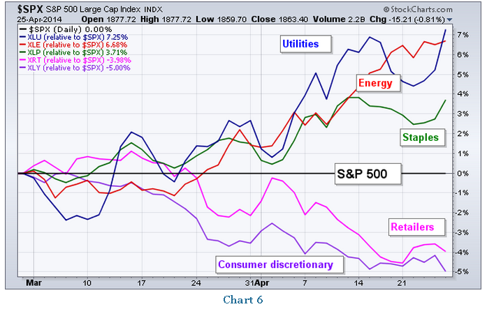
John Murphy's chart summarizes what has been happening in terms of relative strength and weakness and strength among the sectors. Short-term PerfCharts like these are always worth keeping in mind:
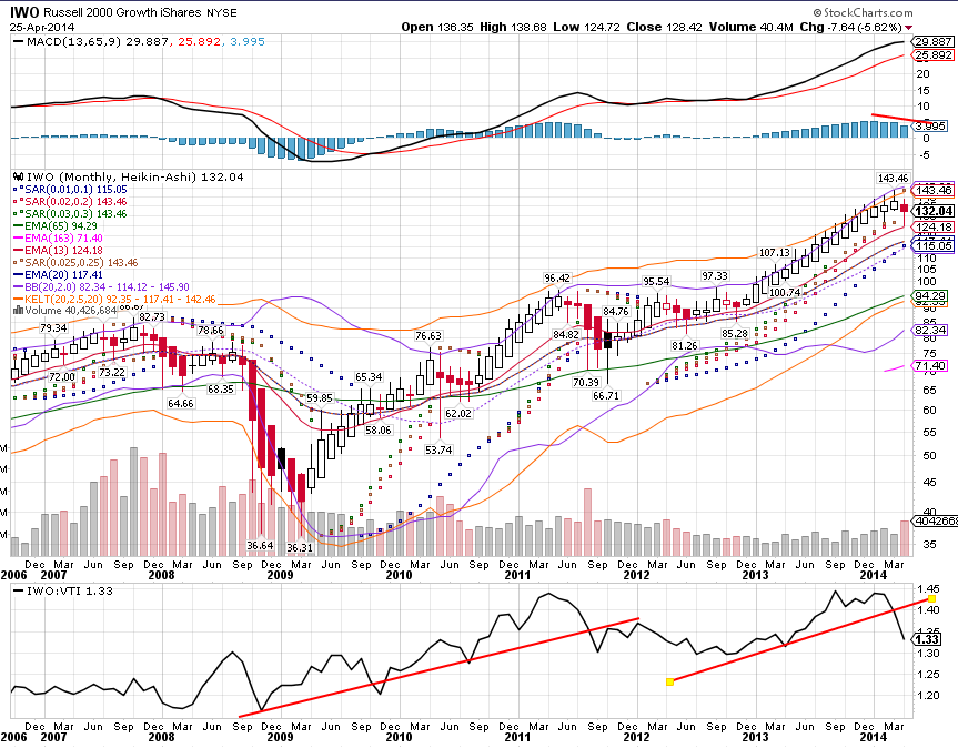
As can be seen in Chris's excellent video posted above, a decreasing MACD line is a troubling sign for any asset on the monthly scale. Such decreasing values often signal further declines are in the works. While the Dow and S&P 500 have relatively remained in place, growth stocks and cyclicals have begun to decline such that their weakness is evident on a monthly scale. Note that the candlesticks below are Henki-Ashi candlesticks, which reduce volatility to identify trends by adhering to specific rules that derive a new candlestick from actual open, close, high, and low value data. As you can see, the red Henki-Ashi candlesticks are bearish and white ones are bullish. 

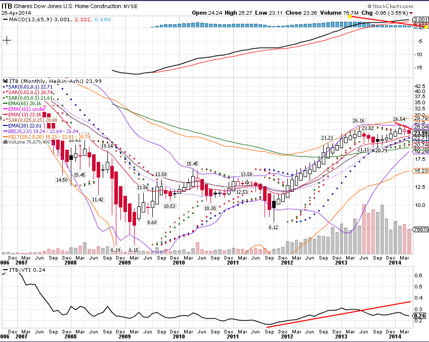
I mark with red lines the negativity present in each chart and the negativity relative to VTI. The charts show decreasing MACD lines, red candlesticks, and relative weakness to VTI:


The NASDAQ, Small Cap Growth, and Consumer Discretionary ETFs are shown above, each representing sectors of the stock market you would expect to show strength when market outcomes are expected to be bullish for US stocks.

Consumer-Oriented Sectors Such as Retail also Showing Weakness

I also include ITB and XRT, the homebuilders and retail stocks. Both sectors are sensitive to consumer spending as housing and retail demand are sensitive to the consumer's spending habits. Both are showing the same weakness as growth stocks, possibly suggesting consumer spending will be compromised or profits from consumer spending will decrease.


Commodities Showing Relative Value and Strength

I highlight the formation of potential breakout patterns and value relative analysis between the price of stocks and commodities, showing the historical under-value of commodities to stocks that may cause upward price pressure on commodities as investors look for the best deals.

We see the price of oil forming a sideways triangle that may breakout soon as volatility is decreasing over the years. The price relative of oil to stocks is near a multi-year low, around the area where oil prices found a bottom against stocks in late 2008 and proceeded to outperform stocks until 2011. Oil's MACD line is also showing positivity. 


$CRB is an index that tracks a wide range of commodities. As you can see, its monthly chart is also showing positivity and it is historical underpriced relative to stocks based on the last seven years.

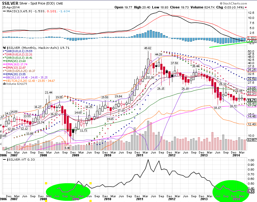
 Silver is unique as both an industrial and precious metal. Its graph also shows relative value and positivity.


These are just a few of the charts I could have shown that echo the same message of upside risk to commodity prices.


Commodity Sensitive Equities Showing Relative Strength

Looking at the commodity sensitive emerging markets (EEM), we can see it looks almost the same as the price of oil with its MACD positivity, sideways triangle, and relative undervaluing to stocks. Emerging markets may begin to outperform US stocks if commodity prices rise.


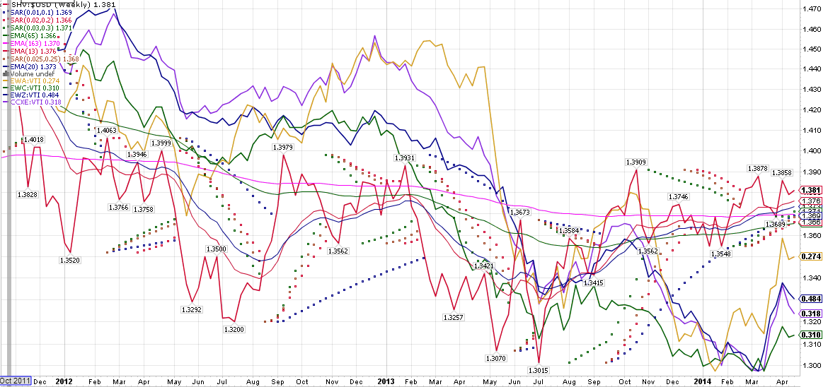
I have produced an additional graph showing relative strength in the commodity producing countries including Brazil, Canada, and Australia. I have charted these countries relative to the inverse value of the US dollar, a proxy for inflation (decreasing value of the dollar).


Finally, I have charted commodity sensitive US sectors (XLB and XLE) with the inverse dollar in addition to the relative performance of value stocks versus growth stocks on a monthly scale. Value stocks tend to outperform growth stocks during times of rising inflation. As you can see, all these measures are showing positive movement i.e. outperformance of value over growth and commodities versus total US stocks. 


Putting the Story Together: Commodity Risks to Upside and US Growth Risks to Downside due to Inflation Risk?

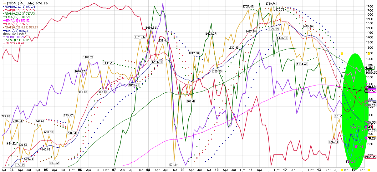
I chart below a range of inflation sensitive prices including Gold Miners, which often precedes rises in gold prices, the inverse dollar, $CRB, and short-term interest rates, which rise with the fed's efforts to tame inflation. As the green circle shows, all these charts are showing positivity with monthly higher highs and higher lows, evidence of a upside movement.


So, are current headwinds in the stock market due to global markets pricing in an inflation risk?

After considering the evidence I provide here, read the following correlations between inflation and asset prices:
http://www.investopedia.com/articles/investing/052913/inflations-impact-stock-returns.asp

In addition, consider the commentary on Fed activity provided below:

"What ought the Fed to be doing right now? The Fed ought to be tightening. Though growth is not robust, "robust" growth cannot be the standard demanded before starting a tightening of monetary policy,especially when there are tremendous excess reserves. The monetary policy car has no traction with such huge reserves, and the Fed needs to start trying to get control so that when it is time to steer, it can do so. Moreover, with disinflation fears waxing - incredibly - at the FOMC, inflation is in fact heading higher. Median inflation should approach or exceed 3% this year, despite the Fed's belief that it will be well below 2% for a very long time. In a few months, the fear of disinflation and deflation will seem quaint."
-The Inflation Trader, Seeking Alpha Commentator, April 10th, 2014

Historical Article: Capture Ratio Investing

[This post features content from my discontinued blog, Specwinds. The information in article may be edited from its original form. This particular post develops an active investment strategy that identifies losers and winners using  a form of relative strength. This bears some resemblance to stockcharts.com's new Relative Rotation Graphs http://stockcharts.com/freecharts/rrg/. I do not use this strategy currently, but the idea behind it has continued to evolve and its DNA is present in my current strategy.]

From 2/2/2014-

Over the weekend, I investigated another method of evaluating potential trade and investment options. This method of analysis is powerful as it enables one to categorize any stock or ETF according to its relative performance versus a benchmark. This method relies on the capture ratio, or the amount of up movement on up days of a benchmark versus the amount of down days on down days of a benchmark. In other words, one can find out how high a stock has gained value on "up days" of a benchmark and how much it has lost value on "down days" of a benchmark over any period of time. Morningstar.com provides this information for 1, 3, 5, and 15 years on most ETFs, but I wanted a shorter time length to capitalize on shorter term movements, and the ability to work with stocks.

Therefore, using Nasdaq.com's historical price data (as of 1/31/14) and Excel, I produced a spreadsheet that calculates capture ratios for any set of price data compared to any benchmark data. For my purposes, I chose VTI, so I could evaluate stocks and ETFs according to the performance of Vanguard's Total US Stock Market fund.

The following is an example of the up capture % calculation: IF VTI's (Day(X)'s Close / DAY(X-1)'s Close)-1 > 0, THEN, % Up for Fund or Stock (Z) = Z's Price Data when VTI has up day or SUM((Day(X)'s Close for Z / DAY(X-1)'s Close for Z) / VTI's Price Data when VTI has up day or SUM(Day(X)'s Close for VTI / DAY(X-1)'s Close for VTI). The down ratio is computed similarly, but data is selected for VTI's down days, or when (Day(X)'s Close for VTI / DAY(X-1)'s Close for VTI)-1 < 0.

Then, I graphed a variety of funds and stocks using the up and down capture percentages as x and y coordinates, where x=down capture % and y= up capture %, giving me a useful visual, which I then modified with Photoshop for the overlay:

Interpretations and Importance

VTI's score is represented by (100,100) on this graph as VTI gains 100% and loses 100% when VTI has up days and down days. This is the joining point of all the colored regions and where the most clustering is found. The clustering around (100,100) makes sense as the majority of stocks and funds are correlated closely with the progress of the entire index or benchmark. However, where a fund or stock lies relative to (100,100) is telling for what performance you would have realized if you had invested in that fund over the last 6 months.

For instance, the best funds lie in the green box. The green box represents those funds with a down capture score of <100 and and up capture score of >100. Why were these the best? Because having a score like (80,130), for instance, means that the fund realized 80% of the down movement of VTI (i.e. 20% less), while realizing 130% of VTI's upward movement (i.e. 30% more). As one can see, such a green box fund outperformed VTI on both VTI's up days and and down days, meaning it gained more when VTI was positive and lost less when VTI was negative.

Another point of note is the red diagonal line with formula y=x. VTI is on this line at (100,100). Any fund that lies on this line, or is close to it, moves at some factor proportional to VTI. For instance, JNK, the high yield bond fund has a score of (22,22), which means it had a down capture of 22% and up capture of 22% relative to VTI. Therefore, JNK on average, moved the same direction as VTI for the last 6-months, but at a magnitude of 22/100, so it gained less and lost less, but in the same direction as VTI. This diagonal line separates the overperformers from the underperformers as being above the line means a fund is an overperformer with greater up capture than down capture (y>x).

Finally, there is a volatility measure present in this analysis as well. As you can see from the High Vol. and Low Vol. dimensions, the higher the score above 100, the greater the volatility or the greater the magnitude the movements that fund is experiencing relative to the benchmark. A hypothetical fund with score (320,400), for instance realizes 320% the downside and 400% the upside of VTI over the past 6 months.

Why do I have a blue section? Well, I distinguish the blue from green sections by the downside risk they presented over the past 6 months. If a fund was in the blue section, it is going to outperform in an uptrend for VTI (when # up days >> # down days). Why are these problematic? If VTI is experiencing sideways activity, these blue section funds become less attractive as they are outperforming on the upside AND underperforming on the downside. Therefore, as # up days approaches the # of down days, these funds will start to underperform and their higher volatility will become a disadvantage relative to green section funds.

I have included the top ten listings on the ARCA Institutional Index on the chart above, which are the top ten stocks held by hedge funds. Notice where they are located. The majority of them are in the orange section (PG, WMT, CVX, JNJ, XOM, T, etc). Only 2 of them are in the green section (GOOG and MSFT). What this means is that the majority of the top held stocks underperformed VTI over the past 6 months. Only investors holding GOOG and MSFT would have beat the Total US Stock Market. What's cool about this result is it reaffirms the outperformance of index funds in uptrending markets such as occurred in the past 6 months. Notice that Berkshire Hathaway (BRK/B) lagged the total market as it is located in the red rectangle (Some claim owning BRK/B is like holding a mutual fund. If this is true, than it was a poor choice of fund for the past 6 months. Historically it is important to note BRK/B does best in the long term by outperformance during bear markets).


How Could this Information Be Used?

The classic technical analysis fallacy that past performance predicts future performance is certainly important with any look-back strategy and analysis. As such, the warning that such past-based analysis may mean nothing for the future is certainly in play. However, fund and stock performances do tend to last for actionable periods of time. Thus, there is a higher probability that funds and stocks experiencing outperformance will continue to do so in the weeks and months ahead.

Fund performance can be predicted by performance of the benchmark. Using the info in the chart above, I can guess what a fund will do on a given day given VTI's performance for that day. Thus, VTI's trend direction becomes a useful tool for determining what to buy. As I mention above, green section picks are all excellent options when VTI is in a long and intermediate term uptrend, while blue section picks will rocket higher when VTI is in a short term uptrend and experiencing multiple up days in a row.

Obviously, graphing the performance of a hypothetical portfolio comprised of these stocks and checking its performance over the last 6 months would represent the ideal outcome if one had traveled to the future and invested in July 2013 in the funds known to have outperformed by January 2014. However, even though this is the ideal (past performance matches future performance), it gives an idea of the power of the capture ratio if some of that historical outperformance continues forward into the future.

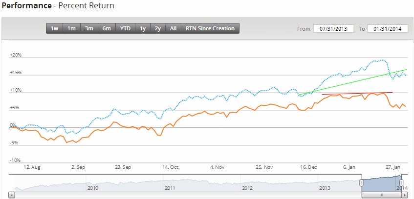
I used Motif to construct the ideal capture ratio portfolio, weighted by how far the option entered the green section relative to (100,100). I then used Motif's webpage to graph the six month performance.
Look at the green and red lines! The power of the capture ratio causes the portfolio (blue line) to form a positive divergence to VTI (orange line). This means the portfolio as a whole increases in value as VTI goes sideways. This portfolio also outperformed VTI by almost 10%! over this period (15% vs 5% gains).

A powerful strategy could attempt to achieve some significant fraction of this type of ideal outperformance by continually rebalancing a portfolio constructed from the latest capture ratio data for a set of funds or stocks. This measure could also inform about which stocks to pick in different market environments. When its time to be defensive, lower volatility stocks or funds would useful in general.

Check out the performance of the portfolio constituted of blue sector funds above! As we know, VTI experienced an extended up trend with # up days >> # down days, so the blue sector's volatility would have been an advantage over this period. This portfolio gained 22%, outperforming VTI by 17% and using no leverage! One could hypothetically swing trade blue sector funds whenever VTI is safely in a short term uptrend. For instance, if one had bought this portfolio on Dec.16th and held until Dec.31st, when the markets where safely in the Santa Claus rally, a 5.5% gain could have been realized in two weeks (the total performance of VTI for the past 6 months!).


Historical Article: Weekend Analysis: Cracks in the BRIC a Risk to the Global Economy

[This post features content from my discontinued blog, Specwinds. The information in article may be edited from its original form. This particular post features outdated forms of analysis that I no longer use. I am posting it on this new blog to preserve it for historical interest. It features one way technical analysis can be used to learn about the current state of the markets, featuring relative strength analysis to identify winners and losers. ]

From 1/25/2014-

In light of the weakness experienced in US markets at the end of the week, I wanted to explore the potential danger areas in the global economy to assess where the current risk to financial markets and the global economy lies. In this article, I will analyze the relative demand for various emerging markets and currencies.

Argentina and Turkey
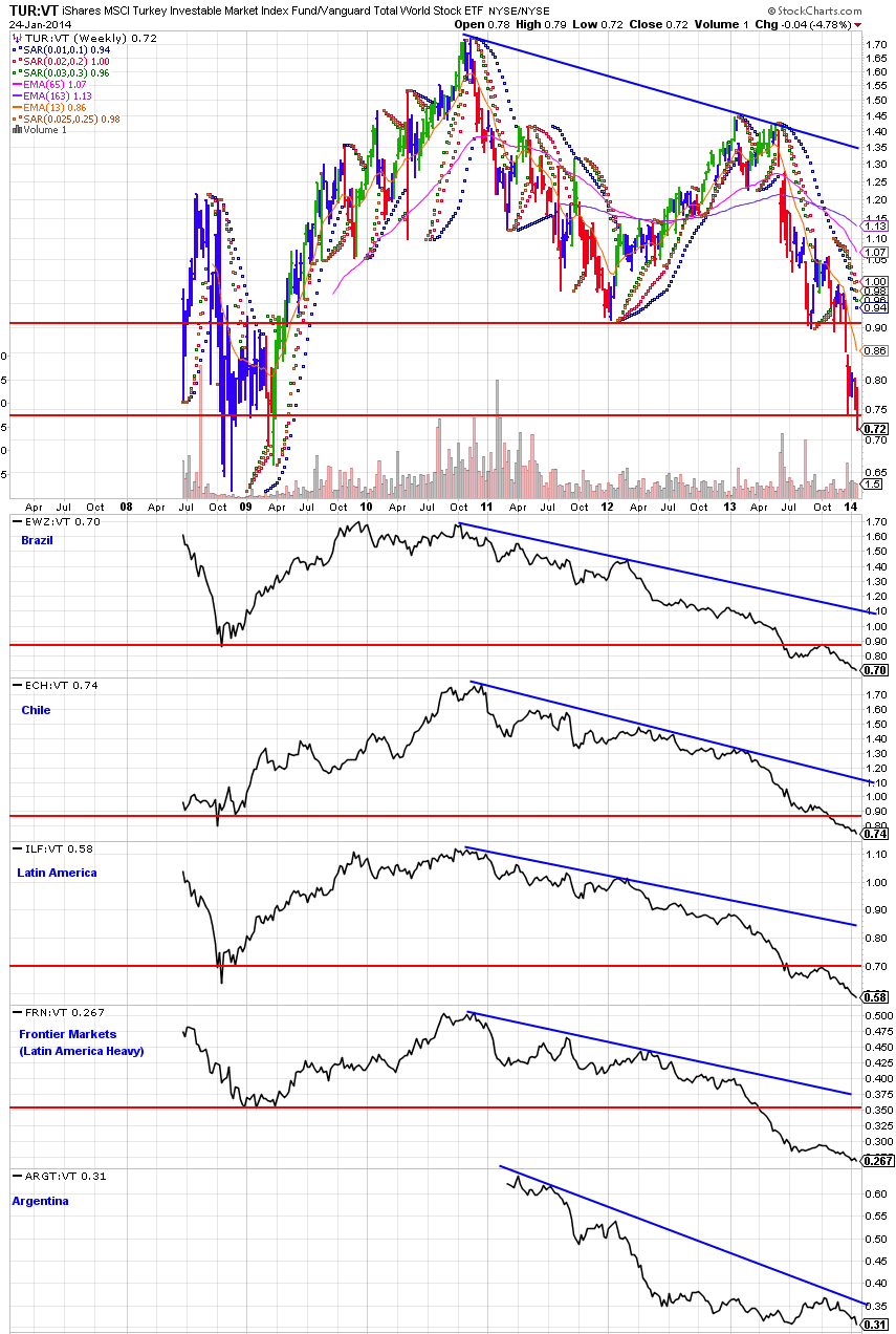
One of the rumors circulating the web is that Turkey and Argentina are experiencing a potential financial crisis. As you can see below, relative demand for Turkish equities (TUR) is plummeting to 2008 levels relative to global equities (VT). This chart verifies the current weakness of Turkish markets relative to the rest of the world. ARGT is the only Argentina specific ETF, but it was started after the 2008 crisis. However, we see that ARGT is still in a downtrend relative to the rest of the world equities since its start of trading. In order to compensate for the lack of a long term Argentina ETF proxy, I then pulled up the Brazil (EWZ), Chile (ECH), Latin America (ILF), and Frontier Markets (FRN) (with majority holdings in South America) to see their status. Alarmingly, as we can see from the blue trend lines below, the entire region has been experiencing weak demand relative to global equities. All the slopes are almost the same, with Argentina's slope showing the steepest downtrend. Its worth noting too how steep Turkey's downtrend is since mid-2013, which indicates rapid investment withdraw from the region.
(click to enlarge)
Why is this set of charts important? Well, it means money is flowing out of these countries and the Latin America region in general. If countries suffer a decrease in relative demand, it is safe to say that investors are concerned about the economic conditions of those countries and are putting their money elsewhere, seeing both a reduced reward to risk ratio in investing in the weakening countries and bluer skies elsewhere.

What About the BRIC?

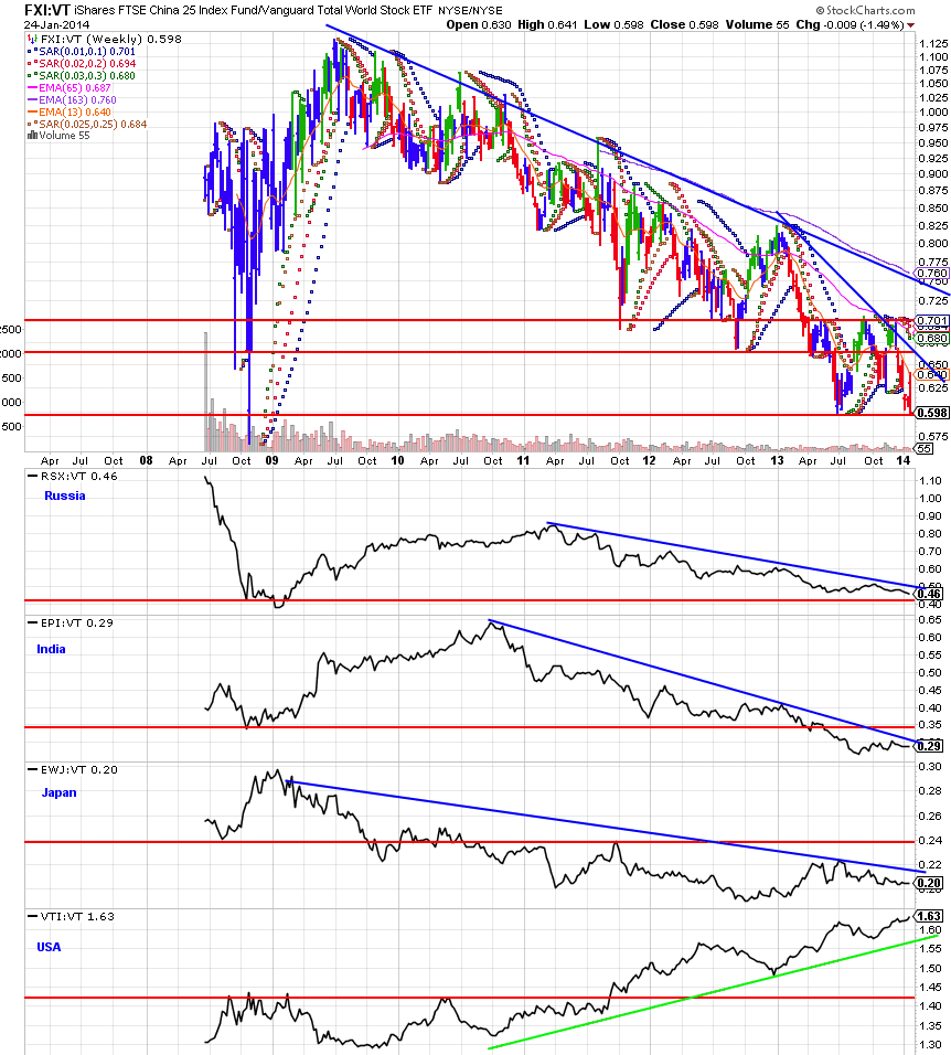
Since Brazil is showing weakness and is also a member of the BRIC group of emerging economies, I decided to check the relative demand of the other BRIC countries, Russia (RSX), China (FXI), and India (EPI), to see if weakness is also present there.
(click to enlarge)
Sure enough, the other three BRIC member countries are also underperforming the global markets. The negative reaction to the decrease in China's manufacturing output this month makes sense in light of China's already weakened performance relative to the rest of the world. Moreover, we see both India and Russia also in a sustained downtrend. Interestingly, even though Japan is considered a developed nation, it too has been underperforming the global markets. Note: I have included a graph of American equity relative to the world as a comparison for what a country showing strong investor demand and performance looks like. As we can see, its graph is almost an inverted version of the other countries, reflecting investor confidence and demand for US equities as the US economy recovers and shows strength.

The MINT too?

Having looked at the BRIC countries, I then pulled up the MINT group, nations at a similar stage of economic development. Turkey is a member of the MINT, as well as Mexico (EWW), Indonesia (EIDO), and Nigeria (NGE). I have also included South Africa as it also is sometimes associated with this set of nations. Interestingly, we see parallel shorter term downtrend. Since late-spring 2013, the MINT countries have also seen a drop in relative demand, joining the BRIC nations. Putting the BRIC and MINT charts together, we see an overall weakness in many of the emerging financial markets. The emerging markets are in trouble, as widespread risk and lack of investment demand has spread through the major emerging markets. Could this be the global contagion that could spread to the US, an emerging market caused downturn or recession?
(click to enlarge)
Further Signs of Low Confidence in the BRIC: Currency Values

One of the downward pressures on relative currency values is a reduced faith and confidence in the government or economy of a nation. Fears over economic troubles in less developed nations particularly causes a run on that countries currency as the domestic currency is traded for currencies of perceived higher value and safety. The reason I am looking into currencies is that one of the rumors about current risks is a potential currency crisis in emerging markets. Unfortunately, the chart below confirms weakness in emerging market currencies (CEW) including the BRIC nations. For comparison, we can see the more healthy chart of developed markets currencies (DBV) as shown by the green line. Even though I do not have ETF proxies for these currencies, the Turkish Lira and Argentine Peso are losing value at an alarming rate. (see: http://thekeystonespeculator.blogspot.com/2014/01/argentine-peso-and-turkish-lira-fueling.html).
(click to enlarge)
One potential ray of hope for the situation is the relative quiet of the value of the US dollar (UUP). As we can see from the purple lines, the value of the US dollar spikes rapidly during times of economic crisis as the US dollar is seen as a safe haven currency and investors panic and rush to cash (something that should still be seen in a crisis considering the United States relative economic strength). Such a spike is not present as of now, signifying that global markets are not at a crisis point yet. Gold (GLD) and treasury prices (TLT) are picking up, reflecting short term fears that are coherent with the US stock market's recent drop, so worry is present, though not panic.

Further Issues with the Global Economy: Weak Commodity Demand

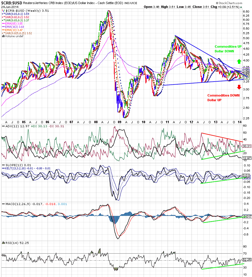
Another chart worth looking at is the price of commodities relative to the US dollar. This sort of chart can serve as a proxy for both inflation and, more importantly, economic demand for raw materials, the stuff that comprises the stuff economies thrive on. So what does the chart say?
(click to enlarge)
Since a local top in the first half of 2011 (sound familiar to the BRICs?), commodity prices have been dropping relative to the US dollar, forming a symmetrical triangle that likely indicates a major trend is about to begin in the next weeks to months. The trick about symmetrical triangles is they do not necessarily privilege one direction of change or another. This stockcharts.com article claims about 75% of all symmetrical triangles are continuation patterns, meaning commodity prices may be set for a leap upwards in continuation of the uptrend started in 2009, or interestingly from uptrend present before the 2008 financial crisis (depending on how you draw the triangle).

Another hint that commodity prices may be set for a leap is the positive divergence present in the technical indicators as marked by the green and red lines. However, an upwards move is not guaranteed and markets are indeed at a crossroads. US equities are already diverged from commodity prices, which is unusual as both asset types typically move in tandem. The divergence in an historical relationship typically demands a reversion to restore the relationship. Thus, if commodities fail to the downside, US markets will not be able to escape the gravity of decreasing commodity prices, which would also coincide with a global economic downturn. Alternatively, if commodities jump upwards, the relationship will be restored to the upside, supporting further US equity price appreciation.

It is interesting to consider this chart in relation to the currency analysis down above. A failure of the symmetrical triangle to the downside would coincide with a spike in the value of the US dollar, precisely what is currently lacking in the currency charts. However, we can predict that if a global financial crisis does occur, this triangle will fail to the downside and the dollar will spike as in other times of crisis. The markets are really at a crossroads considering the emerging market currency issues and weakness in commodities put together.

Where is the Money Going?

If the emerging markets and commodities are struggling, what areas are leading the world in a positive economic direction? Well the US is certainly doing well. Developed markets in general excluding the Asian-Pacific region as a rule are showing continued strength. Thus, US (VTI) and Europe (VGK) are doing well compared to the rest of the world and are safer places to have money. While money from the BRIC nations seemed to make its way to US and eventually European markets, the recent outflows from the MINT nations have seemed to make its way into the Middle East (MES). As shown below, the Gulf States ETFs (GULF) are showing bullish developments and increasing demand relative to the world economy as the MINT countries have begun to struggle. The MES ETF in particular is heavily weighted towards Gulf State financial institutions, so investors are showing favorable attitudes towards the development of Middle Eastern banks and other financial institutions.
(click to enlarge)
Current Implications

It is apparent the BRIC, MINT, and other emerging nations require a close eye to determine if their weakness will put substantial brakes on the global economy. Moreover, commodities are also at a decision point, and also threaten global economic activity. The US Dollar should also be watched as a rapid rise in its value will signal a panic situation is developing. Otherwise, it is best to have one's resources in developed markets, particularly the US and Europe, with the Gulf States constituting a potential wild card opportunity to make money in the current climate. If these currently strong options begin to lose value for extended period though, as commodities and emerging markets further drop, a global downturn could be occurring, at which point it will be best to be in cash, long-term government bonds, or shorts. However, the US markets have not entered a panic yet, so it is possible that more time is needed to play out the current developments. Alternatively, all these weakness could resolve to the bullish side, representing the positive and ideal situation. If this outcome occurs, the BRIC and MINT countries will likely become excellent investment opportunities as their prior weakened demand make them a better value if the entire global economy is moving to healthier outcomes.


Goals and Principles

[This post features content from my discontinued blog, Specwinds. The information in article may be edited from its original form. This particular post features the investing interests I still hold today.]

The Goals


I am primarily interested in developing strategies for the following three aspects of trading and investing:

1) Breakout Growth

Popularized by William O'Neil at Investor’s Business Daily, and utilized by a countless number of traders, including Dr. Wish as Wishing Wealth, Breakout Growth strategies seek to capitalize upon those high flying stocks that appreciate 100% or more per year. Institutional investors give birth to these high flyers with large spikes in volume supporting large price moves. Those breakout stocks making new highs are even more attractive as they lack technical overhead resistance in price to slow their growth. Call them high flyers, rockets, etc, these stocks provide exciting short-term trading opportunities that can be captured with planning and discipline. I currently seek to have the greatest exposures in my portfolios to those holdings that are breaking out to new highs. This is accomplished solely through observations of price.

2) ETF Trading

Exchange Traded Funds (ETFs) are great additions to the markets as they allow large bundles of stocks or non-equity assets to be traded like stocks. These investment vehicles give the consumer investor access to a much greater diversity of asset types than was traditionally possible. Considering ETFs can track assets that do not include stocks, they can be great options for trading assets that are less affected by the overall trend in stock prices. Using ETFs (or ETNs), one has access to international equity, commodities, bonds, leveraged, futures, and short selling stocks without needing margin accounts or brokerage accounts with access to the markets for these other asset types. 

Since they are traded like stocks, ETFs also lack many of the withdraw penalties for frequent trading that mutual funds have. Due to their nature of being bundles of stocks and also managed by professionals, ETFs can provide instant diversification and a lower risk investment than buying any one stock. Therefore, ETFs are excellent tools in one's trading or wealth management arsenal. I take advantage of trending ETFs and ETFs with strong relative strengths to capitalize on strong groups of stocks or alternative assets and take advantage of their broad reach for my diversification needs.

3) Long-term Portfolio Management and Strategic Diversification

Enhancing a long-term portfolio with technical analysis can readily reduce draw downs and increase returns for long-term holdings. When the S&P can draw down 50% in times of panic, it is extremely valuable to know when to move funds into alternative investments or to cash in order to avoid these drawdowns and keep one's wealth growing as consistently as possible. 

Inspired by Chris Ciovacco at Ciovacco Capital Management, I develop long-term strategies suitable for both conservative holdings like 401k's and IRAs as well as highly aggressive and leveraged capital appreciation funds. Using pricing data, my models produce profitable portfolios at are actively updated to stay in step with current market conditions to avoid painful, and avoidable losses of capital.

These strategies are crucial for preserving and growing those gains from the breakout growth strategies with a low volatility, high gain focus. In the spirit of an investment bank, all cash should be “put to work” in the most attractive investments available as consistently as possible. A savings account certainly is not always the best place to park one's cash. If cash can be put to work to grow itself, then it should. Thus, profitable, actively managed portfolios are efficient methods of keeping cash deployed where it should.

The Background Principles


1) Don't Predict the Markets, Actively Adjust Strategy to Most Current Market Conditions

The market relishes the chance to prove prognosticators wrong as often as possible. Since the market is often unpredictable, it is worthwhile to develop approaches that respect this uncertainty and that keep large heads and fortune-telling bugs in check. I really admire strategies like those at Wishing Wealth and Ciovacco Capital, which focus, not on predicting the markets, but technically diagnosing its present state to take advantage of what the market is doing in the immediate term. 

The market cannot transition to a new state without intermediate and often ambiguous steps along the way. Thus, as long as one can respect what the market is doing in the immediate term on a consistent basis, they will find themselves where they need to be when the winds of fortune change, or if the winds do not. Therefore, I will not attempt to predict the markets. At most, I commit to the current state which implies a prediction of sorts. Thus, if I am bullish, I am bullish based on the evidence presented today and expect things to remain bullish until market conditions change sufficiently, which includes by the next day.

Yes, this means I believe one can be profitable in the markets without any fundamental understanding of how any one asset is valued. You can profit from a decline in oil WITHOUT understanding the global economics of oil pricing. You can profit from stocks WITHOUT knowing exactly how much money company is making and who is the CEO. The value of your holdings, no matter what you fundamental theory of their value is solely based on price. Your assets are only worth what others will pay for them. No matter how much cash your prized company is making, no matter how much you think the threat of rising interest rates and the FED will cause long term bonds to fall, it means nothing unless someone will pay you for it.

This is a highly democratic and accessible form of trading and investing that it is not in the financial industry's self-interest for you to know. Anyone with a computer and access to price data can beat the market in the long term, with minimal effort. Is this way of investing for everyone, no, but with algorithmic account management and plummeting trading costs on the rise, the financial adviser system as we know it today, is already on the decline. Don't speculate, observe. Don't gamble and guess, trade in the present and profit.

2) The Trend is Your Friend, Do Not Bet Against the Trend Until a Trend Change is Confirmed

While history has no necessary effect on future price performance, from a probabilistic standpoint, prices do have memories of their past movements. Support and resistance zones in price will often be respected and many stocks have price inertia, or continue to move in one direction for an actionable amount of time. This basic truth about prices is what allows trading to be successful in the first place. It is also the fact that allows technically managed portfolios to have great success during large draw downs in traditional assets.

If price is going up, it will continue to go up until acted upon by an equal or opposite force (buying and selling pressure, supply and demand, etc) and vice versa. While contrarian trading and investing can be very profitable and it is important to recognize when markets are too overheated or overcooled to anticipate trend changes, one should only act opposite the current trend when a new trend has formed (which is to say, practically, one should avoid trading opposite the trend). Trends have many pullbacks, but only one reversal.

This principle is related to IBD's advocacy of averaging up. While one can certainly play chicken with a stock, placing bets on a bottom being placed and averaging down, this strategy is particularly risky. Rather, buy a stock as it confirms your expectations for it, not as it denies it. Besides, why waste time playing chicken when there are thousands of other trading opportunities opening and closing if one is willing to look!

3) Utilize Proper Risk Management

Often the most challenging part of overcoming the risk-seeking of human behavior, controlling one's risk exposure is essential to long term success in the markets. No matter how good an idea you think you have, it is not ever worth betting the farm unless you are prepared to live homeless. There are always new opportunities and, thus, capital should be never be deployed in an all at once fashion. Therefore, the risks you are taking should ALWAYS match your risk-tolerance and your expectations for return.