
In this article, I will address a question financial advisers are considering for their clients' portfolios. With the ECB easing, many US investors may consider investing in Europe, potentially taking money out of their bond funds, which have appreciated considerably over 2014 to invest. Is this a good idea? Let us see how technical analysis can help.
What do the charts say?
First, let us look at the chart of TLT, the long term US government bond fund. This fund increases in value as long term yields decrease and is a good proxy for the performance of long term bond funds.
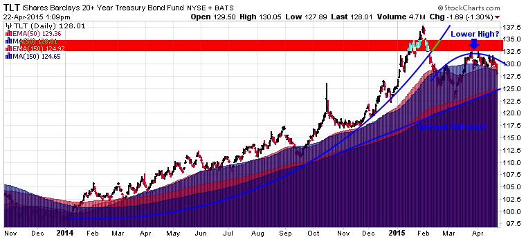
We can see the huge parabolic run up in bond prices throughout 2014, with prices peaking in January 2015. Prices broke out of the parabolic rise and sold off all the way to the 150 day EMA by late February. Since then, bonds may be putting in a lower high, the beginnings of a potential trend change. However, it is still early to call a top in bonds and bottom in long term interest rates. The long term uptrend is still intact. I would look for a break of the 150 EMA near $125 to confirm further weakness in bonds. A successful break above $133 would negate the topping formation.
While it is early to call a top in bonds, it may be useful to keep the very long term picture in mind from my previous article which showed prices hitting the top of a 30 year trend line: http://www.maintrimmercapital.com/2015/02/the-last-time-this-happened.html
What about Europe, as represented by the VGK?

VGK is farther along in a trend reversal than TLT on the daily time frame. With a higher high and higher low after the sell off in the second half of 2014, VGK looks positioned to continue higher. A successful break above $57 would confirm this strength. A short term value purchase for this stock is just above the marked higher low near $52.50 on any pullback. While VGK's daily chart looks good, the potential for a larger decline is still present on a longer time scale. The 2015 rally could technically be a bear market rally. This option would only be confirmed if VGK fails below $52.5 into its prior lows. The 2014 sell off was not excessive (<20%) and the global environment for equities is currently favorable, so a turnover while possible is unlikely.
Finally, we will look at the VGK:TLT relative price chart:

TLT has clearly been outperforming VGK since early 2014 will the moving averages in bearish mode in to 2015. However, at the far right, we are starting to see the short term red moving average peak out from underneath the long term blue moving average, which may indicate future trend change where VGK will outperform TLT. This chart mirrors the TLT chart in confirming historical strength in TLT, but potentially indicating the beginnings of TLT underperformance.
What is the verdict?
The strongest chart is the VGK chart as it appears in the late stages of a bullish trend change, so an investment in Europe will likely be profitable going forward. If one wanted more information from price to decide whether to sell TLT and buy VGK, then watching TLT closely going forward will be crucial. If TLT progresses in its potential bearish trend change, then VGK will clearly be favored going forward. While TLT has yet to confirm a trend break, if one had to choose today, it appears risk is higher to the downside for TLT and to the upside for VGK. However, this is more speculation until TLT confirms. Nonetheless, putting TLT aside, VGK appears to be a good investment going forward, with risk well defined at the recent lows where one could place a stop.
Further thoughts on including VGK in your portfolio
A US investor with assets primarily in US dollars must be aware of currency risk in every foreign investment. Buying a foreign asset is necessarily taking a position on the future of that foreign asset's home currency, so some hedging may be necessary based upon the value of the US dollar. I outline this issue in the "hedging out currency risk" portion of this article.
Further, correlation analysis is huge for constructing portfolios that are truly diversified. I use stockcharts.com's correlation coefficient to do my own analysis. The calculation is explained here. In short, assets with a correlation higher than 0 move in the same direction and those with a negative correlation move in opposite directions.
For diversification purposes, I have determined that assets with a historical correlation of higher than .75 are practically the same. I have made a graph of the correlation values of different ETFs to VTI, the total US stock market. As you can see, VTI has a correlation of 1, which means it moves exactly the same as itself.
You may be surprised to notice how similar VTI is to small caps (IWM), Developed Markets Ex-US (EFA), England (EWU), and Europe (VGK). They all share a .75 correlation or higher.

Therefore, it is important to remember that investing in VGK today does not lower your risk very much over holding VTI alone. The two holdings primarily move in the same direction, so if VTI goes down, VGK is likely going down with it. That being said, the amount by which they move in the same direction also varies. So you may benefit during the periods when VGK outperforms VTI. Thus, investing in VGK only diversifies the risk present in your risk-on or equity component of your portfolio, it does not significantly contribute to lowering the risk of your entire portfolio.
You can see that TLT with its coefficient of of -.22 significantly does lower overall portfolio risk as it often moves in the opposite direction of VTI. This is mathematical proof for why so many recommend holding both bonds and stocks in a portfolio.
For my personal portfolio, I include only QQQ, IWM, and XLU for my developed market exposure. As such, I lump together developed markets under the performance of the United States while avoiding currency risk. From the viewpoint of correlation, Japan, Europe, and the US are similar investments, except for the US is priced in US dollars and, thus, matches my major asset currency. My foreign holdings are only those which are more different from the US and include, China (FXI), India (EPI), and Brazil (EWZ). As you can see from the graph above, these holdings score a .55 or lower in correlation to the US. Here I am willing to forgo the currency risk in order to capture the significantly different performance capabilities of these emerging market investments.
In conclusion, I leave you with the following performance chart of various assets over the last 150 days. Can you see how powerful correlation is here? Look at the dark blue and cyan lines, VGK and EFA, compared to VTI, the red line, and Japan, the black line. Notice where each line dips and peaks. See the similarities? While end returns are different, notice how the directional similarity of each move means diversifying among this group does not protect you from any weakness in equities as an asset class. Compare to the teal line, TLT, and pink line XLU, with their lower correlation, which move differently.
