I update my market models weekly and monitor the trends in their allocation numbers. While I do not follow every market, I follow many important markets via their representative ETFs. There is a list of the current ETFs I am tracking in the sidebar.
Here is a run through of this weeks observations:
The Basic Model
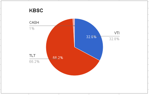
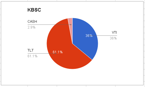
One of my models is a simple allocation program between the total stock market, VTI, and long term government bonds, TLT. These two ETFs are a great pair to follow since they have almost the same average volatility. Thus, they can be compared based on pure relative strength with about equal expectations for each holdings appreciation or depreciation capability.
The current allocation for this program is Balanced (about 1:1 stocks:bonds). This week saw another shift towards bonds with the stagnation in stocks.
Storm Clouds on the Horizon?
As a technical analyst, I am as much a bull or a bear as the market allows at anyone time. Any reasons I could appeal to beyond observations of changes in price are speculation and almost worthless in my book. Thus, with many major indexes near all-time highs, I am more a bull than a bear on US stocks. Also, anytime weakness occurs in the course of a trend, it is probabilistically just a temporary pullback and not a trend change. The markets do trend- they get as many pullbacks as maintains the overall trend and only one trend change in in each trend's lifespan. Thus, you are playing a low-odds of success Russian roulette at best and are fearmongering at worst to call a top at any one pullback (I am looking at you financial media!).
There are a few ETFs I track that are negatively correlated with stock market at times of high stress in the global markets, the five horseman of the US stock apocalypse, so to speak. The five are Long Term Government Bonds (TLT), the US dollar (UUP), the Japenese Yen (FXY), Gold (GLD), and Short-term VIX futures (VXX).
There are fundamental reasons why each of these holdings tends to do well in times of stock stress, although I prefer the simpler observations of the their price performance during times of stress to explain their inclusion in the list. Look at their progress during the 2008 recession, for instance. Nonetheless, I will speculate on fundamental reasons why these are defensive assets, if it is helpful for your own interests. In short: TLT is seen as a conservative investment in the safety of the US government; UUP tends to outperform in the depths of fear as investors go to cash fast, specifically the world-reserve currency, the US dollar as demand for commodities plummet; FXY tends to outperform when Japanese investors, some of the most conservative in the world, ditch stocks and risky assets as well; GLD is seen as a store of value in the face of both inflation and loss of attractiveness of traditionally risky assets; and finally VXX tracks the VIX, an index tracking investor usage of options to buy either upwards or downwards protection for their holdings. The VIX increases when investors buy more puts (downside protection) so positivity in VXX means investors are buying more insurance against potential future losses.
With this background in mind, below is the chart that shows some small concern. In the last three weeks, the NYSE has failed to make new highs (red lines), while the five horseman all show short term positivity (green lines):
Now, there are obviously other reasons why some of these holdings are performing as they are other than solely due to investor risk aversion. TLT and UUP, for instance, are in long term uptrends already. However, if the positivity in at least four of these areas continues, it may mean new lows for stocks due to the historical correlations that exist in the pricing of these different holdings.
That being said, the bullish outcome for US stocks is that the short term postivity in FXY, GLD, and VXX are just more countertrend rallies that have occured before. If these ETFs breakdown lower, stocks are headed higher, breaking out yet again from a countertrend rally of their own. At the least, it will be interesting to watch in the coming weeks.
Finally, neither the US stock market nor the five horseman "cause" performance in each other. So, it is wrong to see strength in any one asset class as causing another asset class to do such and such. Rather, it is more correct to say that they move together in a specific manner (this is the basic meaning of correlation).
Overall
I personally will not be too "concerned" about US stocks until my models start raising cash against my US stock holdings, or US stocks otherwise become unusually small positions amongst my overall holdings. Has not happened yet.
On a "sunnier" note, last week was excellent for TLT, short oil, short euro, and long China. What is good or bad is all about perspective and what positions you hold. My holdings have continued to gain with the negativity in US stocks to start the year.
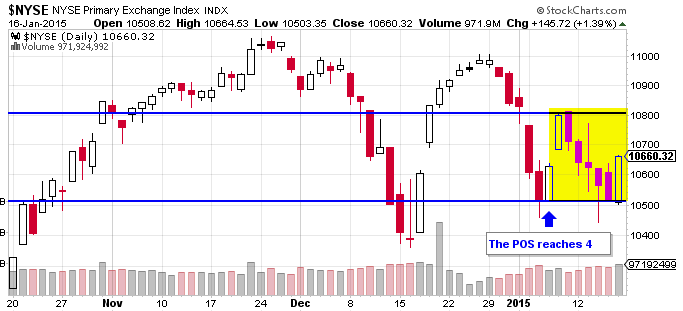
The POS is on a 4, a cautionary zone that means prices are currently treading water and will resolve in one direction or another soon.
Last Words
Keep an eye on the Nasdaq too, this classic growth index has not been doing so hot the last few weeks. It failed to make a new high with the other indexes at the end of December. A sick Nasdaq is another black cloud over the market right now.
Speculating, like gambling, is fun! My observations above, so far as they could be construed to be predicting future downside in the stock market, is speculation. However, I do not trade on speculation and neither should you. Stay in step with the market and you will be rewarded in the long-term. This, in my opinion, is the true reason why Warren Buffet does not believe you can time the market. Timing, done incorrectly, leads too many to try and predict rather than follow trend changes. As I mentioned above, trend changes are very rare compared to temporary pullbacks.
See you next week!